Announcement

Collapse
No announcement yet.

Firefox 89 Released With UI/UX Changes

Collapse
X
 
  • Filter
  • Time
  • Show
Clear All
new posts

  • #31
    Originally posted by leo_sk View Post

    I think its a couple of pixels taller than normal mode in last firefox version, and quite taller than compact mode of previous versions
    Well, I looking them here side by side. But in the name of compactness, I also run the tabs in the title bar (un-mark "Title Bar" in options). I also use the bookmarks bar. In that configuration, 89 is more compact than 88. If I remove the bookmark bar, both are the same height.

    The title bar is taller on 89, but the address bar is smaller, so both end in the same height. Remember that all of this is on KDE. Not sure if other DEs will look different.

    Comment


    • #32
      Originally posted by kpedersen View Post

      So it is generally agreed upon that software that looks like this is modern?

      Just sounds like someone's (slightly tacky) theme to me. There is no such thing as "modern" looking software. Go 200 years into the future and software will probably look the same. Probably closer to the simplicity of Windows 3.1 even
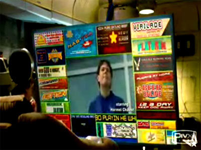
      I like how "modern" essentially means "hieroglyphics" & "pictograms".


      Comment


      • #33
        Originally posted by skeevy420 View Post
        I like how "modern" essentially means "hieroglyphics" & "pictograms".
        Modern means whatever anyone wants it to mean. Blue in style? Its modern lol. Designers
        Last edited by ix900; 01 June 2021, 02:06 PM.

        Comment


        • #34
          CustomCSSforFx already has at least some support for fixing Proton: https://github.com/Aris-t2/CustomCSSforFx

          Here is an example of what you can do with it (pre-Proton since I stay on the ESR branch):

          Comment


          • #35
            Initial impression was that this is bad. But after using it for couple of hours, I actually like it. "Firefox Alpenglow" theme is nice, tab bar works well

            Comment


            • #36
              I like it. I use Compact and maybe I will miss it and maybe it needs to be added again, but it's livable.

              Next thing they definitely have to do is finally remove the so old-schooled windows for history and downloads and site information and replace them with pages, like they did for certificate info for example. Maybe copy-paste the functionality and certainly not reduce it, just turn it into webpages that are with better style.

              Comment


              • #37
                At present there is this workaround with CSS https://github.com/dannycolin/ff-ultra-compact-mode

                What is really concerning here however is their reasoning, one of their main strengths is its customization. If Mozilla is now shifting to enforcing a common default then they will alienate all users who choose Firefox for being able to tinker with its settings and leave us without option. And most of us know what we need, the moment this policy touches the engine settings Firefox will face the same destiny OpenOffice did from the community.

                Comment


                • #38
                  Originally posted by ix900 View Post

                  Modern means whatever anyone wants it to mean. Blue in style? Its modern lol. Designers
                  Heh or, I'm not able to implement standard tabs properly so lets just do any old crap and call it "modern".

                  One day they will break ctrl-c / ctrl-v so will arbitrarily tag copying and pasting as "old fashioned" and people might just start agreeing!

                  Comment


                  • #39
                    Originally posted by skeevy420 View Post
                    I like how "modern" essentially means "hieroglyphics" & "pictograms".
                    I love how you sneaked in screenshot from Idiocracy .

                    Comment


                    • #40
                      I'm on Firefox 91.0a1 (nightly), and it's still good old firefox as far as I'm concerned.

                      The worst redesign in my opinion was Amarok 4.

                      Comment

                      Working...
                      X