
-
Great news. An overrated mediocre developer/drama queen made us a favour and was self-removed from a crucial community project. That guy had more ego than code, and quite frankly he did more harm than good to KDE. -
You asked how that conclusion could happen and I gave you an answer. Maybe KDE's Mailman setup should not strip the leading "RE:" for clarity.Originally posted by Sho_ View PostLeave a comment:
-
I never said overwhelming majority, and that's the big point here. If someone wants a particular feature or wants something to behave in a certain way, if they aren't willing to do the work for it to get implemented, then it's up to the developer. If the developer doesn't have the the time or the interest to do it, then it doesn't get done. Part of being interested in implementing a feature is how much it lines up with your visions for the project and being convinced that a feature should be part of the vision by how people clamor for it. The big question is how do you gauge vocal vs majority? A secondary question is, when do you compromise about what you want in a project versus some subset of users? Even if you can do so and it isn't difficult, adding features can be a mistake -- whether it is for making code maintenance more difficult or driving the project in a direction you don't agree with.Originally posted by msotirov View Post
Again, it seems we're talking past each other here. For one, a lot of developers work on a project to scratch their own itch. Their applications are designed in a way that best accommodates what they want out of it, and does other things because other people want those things and the developer finds it interesting to implement it. If we talk about window managers, something like i3 is rather niche until you start digging down deeper into what niche it fills and who it fills it for. That's in contrast with something like KWin, which is specifically aimed at a larger population. They operate in the same field, but because of the market that they're catering towards, they have vastly different sets and sizes of users.Originally posted by msotirov View Post
I'll disagree also with the idea that developers aren't treating their software as a product. The fact that they treat it like a product is evident in the compromises they don't make. A good (and relevant) discussion is this one involving Martin:
It's very clear from the discussion that Martin cares about the state of KWin and understands the caveats in implementing the initial solution as presented and the landscape of applications that have to be dealt with properly for a satisfying solution.Leave a comment:
-
This is exactly why I've spent a good part of the last 6 months working with the Discover developers to improve the UI, and they've been working hard to fix the crashes and bugs. When we ship 5.13 in a few days, I think you and others will be pleasantly surprised.Originally posted by R41N3R View Post
In no way, shape, or form are we unaware of the criticisms or ignoring the issues. it's just easy to miss the progress if you're not following the development, which is part of the reason why I try to highlight these pre-release improvements over at https://pointieststick.wordpress.com...-productivity/
What kinds of changes or improvements would *you* like to see?Leave a comment:
-
As a developer myself, I had a similar situation as described by Martin when the company that I worked for was bought by another, and the team of this company wanted to rewrite our framework, they thought they knew better than us, didn't listen to our input, in the end they wasted 3 months of work because they had assumptions/premises that were faultyLeave a comment:
-
Hello Nate,Originally posted by ngraham View Post
no offence to your GREAT commitment and maybe 'stupid' (personal) openSUSE (Tumbleweed) only question:
oxygen-transparent-0.1+20141112-6.24.x86_64
oxygen-transparent-liboxygenstyle-0.1+20141112-6.24.x86_64
packages are gone (should be removed).
What replacement do I need to have transparency stay on Plasma5?
Thanks!Leave a comment:
-
So RIGHT!Originally posted by darclide View Post
STOP this 2D (swiping) shit.
We had ages of UI (lab) research.
Look up under haptics etc.
No borders. - Argh.
Konsole without 'status bar'. - Horror.
We have knobs. - Like knives & forks. Generations of people have learned how to use them...
I want to decide myself. - Or leave.
KDE user since the _beginning_ (after self compiled ol(v)wm).Leave a comment:
-
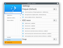
What worries me is that be these overall look and feel initiatives do only provide visual changes to users without real improvements. Discover and system settings are the tools I really do not like to use at all, often they are broken and I do really wonder who of the devs really tested them. I mean to make something more nicer is a nice idea, and I appreciate these small efforts as well, but you should also make them work. Instead of adding new adjustments for existing functionalities, maybe just click once through the menu tree, it is easy to crash discover and system settings and the layout is often broken. How can this go unnoticed? And has it been tested on Wayland? Yes, these applications improved, but that's not an excuse to leave real bugs open just because they mean more effort. If system settings would be simple text list of options, fine to me as well, as long as it works.Originally posted by ngraham View Post
Martin was a guarantee, that the quality improves and that you do not play around with the basic desktop like with normal applications. I can only hope that Kwin is not the next victim of simplistic decisions, but seeing adjustments like Dolphin root window, I have a lot of doubts now.Leave a comment:

Leave a comment: