
 Tweet
Tweet
Read the messages in this thread for full details: http://phoronix-test-suite.com/piper...er/000072.html
Added in to the result file XML specification is a RawString tag that is
composed of the delimited values for all test runs. RawString is
preserved across merges, multiple runs, etc. Phoronix Global also
preserves RawString on uploads/downloads, when the Phoronix Test Suite
1.6.0 Alpha 2 (currently git, to be released in a few days) or newer.
The introduction of RawString doesn't break backwards compatibility with
earlier versions of the Phoronix Test Suite.
The other part of the equation is the introduction of the
"analyze-all-runs" option to the Phoronix Test Suite core. For any saved
result file, run: phoronix-test-suite analyze-all-runs <saved name> and
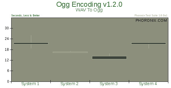
it will re-render the results to show all of the values on the SVG/PNG
graph using the concepts of candlestick charting. Here is the
description from the documentation for analyze-all-runs:
"This option will generate a candlestick graph showing the distribution
of results from all trial runs. The candlestick graph is similar to the
Japanese candlestick charts used by the financial industry, except
instead of representing stock data it's numerical result data from all
trial runs.
The tip of the upper-wick represents the highest value of the test runs
with the tip of the lower-wick representing the lowest value of all test
runs. The upper-edge of the candle body represents the first or last run
value and the lower-edge represents the first or last run value. Lastly,
if the last run value is less than the first run value, the candle body
is the same color as the graph background, otherwise the last run value
is greater."
A few modifications may still take place though to make these easier to
understand.
With that said, attached (or available @
http://www.phoronix-test-suite.com/m...andlestick.png) is a
candlestick graph from analyze-all-runs with a few sample data sets to
show the distribution of results from four separate runs.
Michael