Announcement

Collapse
No announcement yet.

KDE Plasma 5 Officially Released

Collapse
X
 
  • Filter
  • Time
  • Show
Clear All
new posts

  • Daktyl198
    replied
    Originally posted by sunweb View Post
    So except for ugly theme that 99% of people will change right away there is not much improvement really.
    1. I like the new theme?
    2. I see you haven't been paying attention at all. There is an extremely long list of improvements over the last version of Plasma. You can find it in about 300 different places, you have to actively try to be that ignorant.

    About the menu, I definitely remember seeing a menu similar to the Gnome3 menu, but I can't be sure if it was ACTUALLY a Plasma menu, or if they had set their entire desktop to be this launcher thingy (possibly a plasmoid?(or whatever they're called))

    Leave a comment:


  • sunweb
    replied
    So except for ugly theme that 99% of people will change right away there is not much improvement really. Unless its less buggy(i still have occassional bugs some notifications go wrong but nothing serious) and eats less resources.

    Why don't you make a good(nowadays homerun shit level, too slow, absolutely not customizable - that goes against KDE philosophy to begin with) plasma addon that would imitate either GNOME 3 style menu or the one that Rosa did? Rosa as a distro was too crashy for me and noone seems to port their menu anywhere else. Why can't you just create an official addon like that? Thats the biggest complain i have with KDE, so customizable yet have outdated menu types.

    Leave a comment:


  • Blahblah
    replied
    Looks very nice; I've always liked KDE.

    Leave a comment:


  • Awesomeness
    replied
    Originally posted by stevenc View Post
    http://www.kde.org/announcements/pla...ts/desktop.png
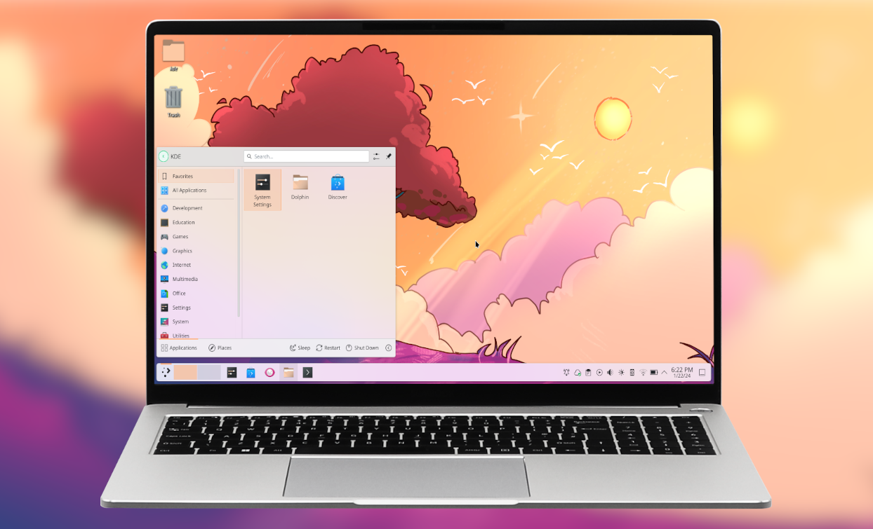
    It looks really pretty, but I have to ponder some of the fine details: why I should feel a mental connection between a picture of a Greek-looking building and my 'Applications'
    Duh, that's because all these applications have been written using Borland Delphi.

    Leave a comment:


  • Sho_
    replied
    ^ About the temple icon, we've actually had the same discussion. I'd expect it to be replaced later. It's one of those bottleneck/fell-through-the-cracks/dropped-the-ball deals - launcher icon theming came online fairly late, there wasn't a lot of time for the icon artists to begin with, and until close to release that icon actually used to be a stylized "A". Which of course isn't acceptable for localization (text in icons is generally a no-no for that reason), so it was replaced last-minute with the temple. I don't think anyone is particularly happy with it.

    Keyboard navigation in Kickoff is actually fairly decent, also in the alternative cascading menu launcher. The KDE accessibility team is currently doing a pass at keyboard- and screenreader-proofing things, though. There's already a bunch of improvements for the latter queued for the first maintenance release.

    Leave a comment:


  • stevenc
    replied
    KDE is an open community of friendly people who want to create a world in which everyone has control over their digital life and enjoys freedom and privacy.

    It looks really pretty, but I have to ponder some of the fine details: why I should feel a mental connection between a picture of a Greek-looking building and my 'Applications'; and the irony of there being one menu category called 'Computer', on my computer. Doesn't look too keyboard-friendly at first glance - I hope there are still ALT-key accelerators for most menus and I can navigate with cursor keys - for those of us who operate a computer with more than one hand (I'm looking disgustedly at you, tablet or Mac users).

    Oh, and small medium-gray text in the light-gray menu might have 'seemed like a good idea at the time', but just because you can, doesn't mean you should.
    Last edited by stevenc; 15 July 2014, 07:52 PM.

    Leave a comment:


  • Delgarde
    replied
    Originally posted by Prescience500 View Post
    You know what would be awesome? Instead of total icon redesigns, every project lead (or whatever KDE calls them) could do their app icons however they want, then have a themeing program that modifies all the icons based on the theme specs, whether it's monochrome, oxygenlike, pastel, etc. That way, only a single change system would have to be changed with the themes, instead of every single icon everywhere on the desktop. I know it's probably harder to make than it sounds, but it would theoretically solve all of the icon theme issues.
    Sure, just wave a magic wand, and everything will be exactly as you want. What, you don't have one of those?

    Leave a comment:


  • Anarchy
    replied
    Congratulations to the KDE guys.

    Leave a comment:


  • asdfblah
    replied
    What is wrong with all the whiners? I bet you haven't used KDE. If you do, but aren't capable of changing the theme/icons/etc... why are you using KDE in the 1st place?

    Originally posted by Aleve Sicofante View Post
    What I don't get is why is this an official release? I understand the Visual Design team had not enough time to get things done. Then why not wait for them to finish? Why do the KDE developers think it's OK to ship such a visual mess AGAIN? Will the KDE teams ever learn that visual design is fundamental to usability?
    If we judge from history (KDE 4.0), official release != completely usable. Let just hope history doesn't repeat again, with people blaming KDE devs for the mistakes of distro maintainers (distributing non-complete software). (OTOH, KDE could have been numbered "4.99", to show it's still being developed).

    Leave a comment:


  • Aleve Sicofante
    replied
    What I don't get is why is this an official release? I understand the Visual Design team had not enough time to get things done. Then why not wait for them to finish? Why do the KDE developers think it's OK to ship such a visual mess AGAIN? Will the KDE teams ever learn that visual design is fundamental to usability?

    Leave a comment:

Working...
X