
-
oiaohm I am not against libadwaita itself as provider of higher level abstraction in GUI creation. I listened a bit of that podcast and they mentioned various stuff... I checked it out and see Elementary OS is enforcing a MacOS style to GUI. No I don't like Mac interface so if libadwaita choosing to bypass GTK stylesheets is due to or inspired by they-did-that-first, then it is one jackass encouraging another jackass in my feeling. -
Its not that simple. You need to know when you are choosing a color blind incompatible theme.Originally posted by billyswong View Post
Its the color of dress problem where you vision changes based on time of day and lighting conditions. This is one of those horrible traps all humans at some point have some form of color blindness. This is just the way humans are constructed.
This also skips over the fact distributions have been patching in their own theming extensions to GTK3 and going to do this to GTK4 and not working with upstream. So after distributions patch GTK they then patch the GTK provided themes sometimes screwing it up. So now its harder to spot user using a non-WCAG-compliant theme.Originally posted by billyswong View Post
This is also only part of libadwaita https://adrienplazas.com/blog/2021/0...ibadwaita.html they talk about it here.
Implementing the HIG is a lot of manual work for application developers. This led to lots of verbose copypasted UI code, full of slight interpretation variations and errors, making applications hard to maintain and full of visual and behaviorial inconsistencies.
As well as addressing the theming problem there is a need reduce the number of issues application developers make when implementing HIG. libadwaita goal is to get rid of some of this code duplication that causes these errors as well.
billyswong the reality here is there is a lot of wrong. There is wrong from gnome, There is wrong form distribution developers and There is wrong from applications developer and lack of guidance to end users all these things have been screwing up end users.
The reality here is the fix does not have gnome developers, distributions developers and applications developer with some level of unhappy because they have to fix things the fix is not really fixing the solution at hand.
Yes visual and behavioural inconsistencies the application developer did really intend todo happens due to coding errors using gtk, EFL, qt, MS windows default toolkit.... So there is need in this department for better tooling to tell developers hang on what you coded here in your UI does not quite look right have you typoed this. Same as needing tooling to validate themes.
Yes gnome core developers are attempting to solve a problem that need solving. I person are not sure they are 100 percent going about it the right way. Yet you have to also remember we know distributions have been extending gtk to add the theming features they want and so call fixing gnome so it useable for end users to have a market advantage.
Yes distributions have so called being fixing gnome for their end users and not submiting that upstream to give themselves a competitive advantage over other distributions. Of course this leads to gnome upstream seeing no reason to be working with distributions because they are going to-do what every they like anyhow and are not going to provide gnome developers with decent feedback or feature request or bug reports.
billyswong gnome actions out of context seams like gnome is being a jack ass for no reason. I would say gnome is totally justified from distributions interactions with gnome to go forwards not caring what distributions need because distributions have not been properly engaging.
The theming problem has been kicking around since the year 2000 and possible before. I know this because it was one of the early issues I raised on the freedesktop mailing list that I said need to be fixed. At the time I could get zero agreement how to fix it. Horrible I wrote back then that what might be required to fix it is if someone just be a total jackass and forced the issue so ruining everyone work around options so forced to fix the core problem.
Leave a comment:
-
The WCAG thing about fitting in colour-blindness is interesting, but largely irrelevant to user themes. Yes, it is a huge matter for applications or websites that are hardcoding their colouring irregards of user preference. But for user themes, a user with colour-blindness can choose to avoid colour-blind-unfriendly themes and pick a high-contrast one freely right?
libadwaita / granite / whatever widget library shouldn't encourage hardcoding colouring into themselves. The original problem of apps failing in custom user themes is due to applications mixing use of hardcoded colours and "system colour" / theme colour and put too much assumption into the system colours / theme colours unknowingly. But now, they seems to be putting "The background colours of container widgets are lighter in light mode, and darker in dark mode" into executable binary, instead of static stylesheets. Whether buttons shall be flat and borderless should also be decided in stylesheet, not hardcoded in library. (An application may explicitly say "this specific button shall be flat / non-flat", but it should only be done for special cases, not as general design.)
If some applications hardcode some colours but not all and then cause issues in blending in desktop user theme, such programs may need some compatibility mode to circumvent their bugs, but it is still application bugs, not the fault of non-default user theme. Gnome's decision is equivalent to putting every applications in their camp into a perpetual compatibility mode. It is a lot worse than putting "WON'T FIX" onto any bugs that involved non-WCAG-compliant themes.Leave a comment:
-
I wish what you said was what users wanted. People always want todo blocks of text with different color highlights. My text based terminals are normally white text on a black background. So not all people like black on light background.Originally posted by yump View Post
WCAG is a little more complex than dark and light background colors. Remember you have to allow for colour blindness. Yes I had done up a stupid sight for fun a long time ago that had text that was dark red on light red and so on. This site was kind of evil but it was color blindness test.
Calculating contrast for human little more complex than light vs dark. There is very old formal that ISO and ANSI standard that works fairly well.
https://commons.wikimedia.org/wiki/F...e_36_05_06.jpg this here is the problem you have overlooked yump. Most humans have 3 types of cones and 1 type of rod. There are some really rare humans that are female and have 4 types cones and 1 type of rod as sensors in the eye. So the reality is 99% of humans are partly colour blind. So you can ingore the case of 4 cones because what a person with 3 cones can read well a person with 4 cones has no problems with.
The reality is you have 4 calculable contrasts this is where the maths that the ISO and ANSI standard WCAG references for doing contrast is about. Yes you need to look at each 3 cones and 1 rod individually.
The problem you have something can be quite or quite a dark colour that if one cone is missing is not that bright at all. Fun part you can suffer from over saturation so you don't need color blindness for the contrast to reduce over time.
The theory that known that something has light or dark background colours is enough for application to know if there is going to be problem is false. There is a reason why I said application own custom colour should be forbid from missing with theme provide colour. Its not straight forwards just if a color is light or dark that there is truly contrast between them.
Black and white absolutely have contrast because these have contrast because they have contrast on all 3 cones and the rods of the eye. Lets say we did bright red on black background that light on dark. You run the WCAG formula you get a bugger all contrast value. That right bright red is only bright with a single cone in the eye if that missing its almost no different to pure black. Yes you can run into the problem with the right light blue as well where there is not as much contrast as one would first presume.
yump WCAG as you say may be forgiving. Key thing here is when WCAG says you don't have enough contrast you really don't have enough contrast. The complexity of calculating contrast comes about due how the human eye is constructed.
Also this is not the only problem.
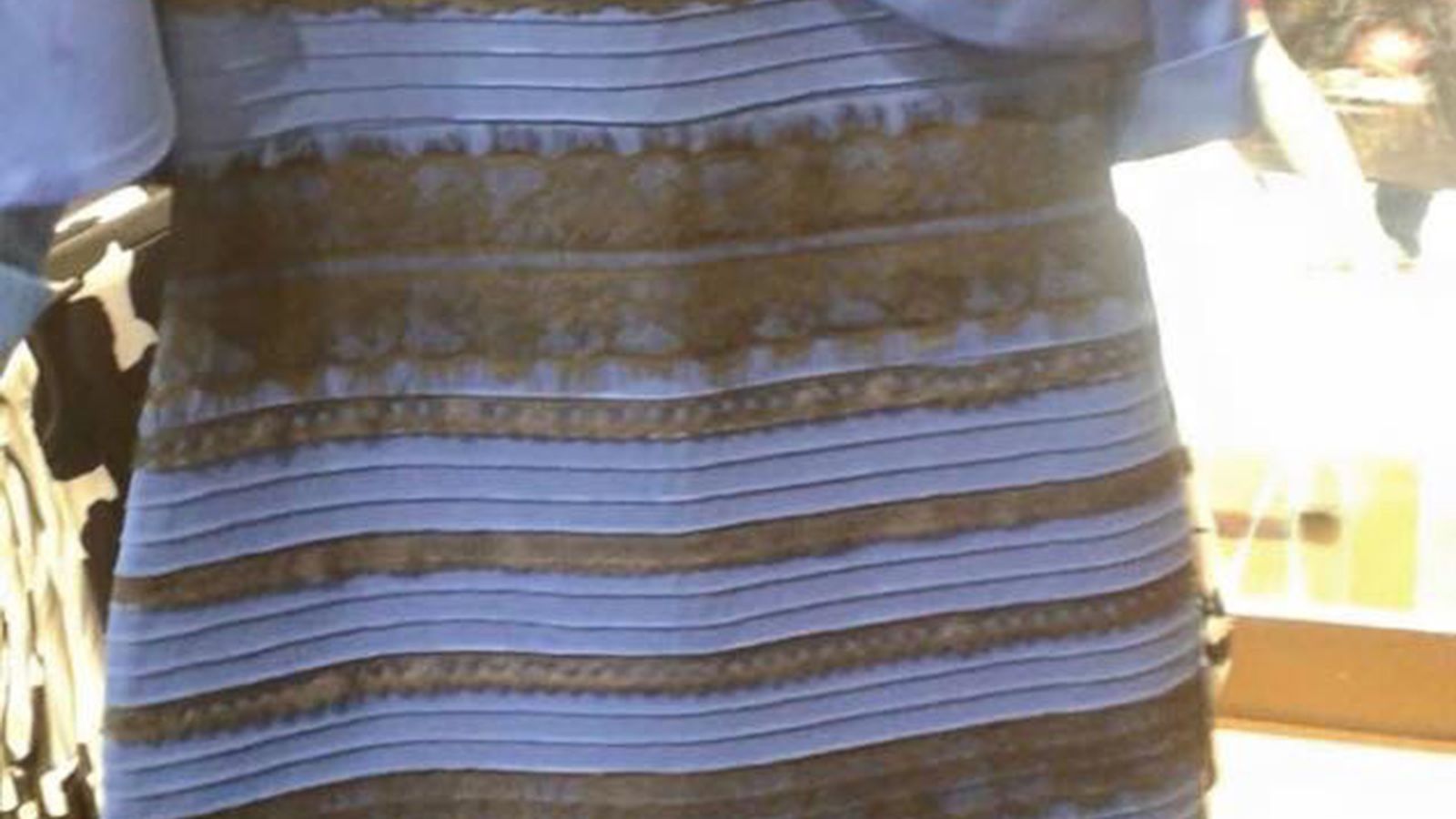
https://www.vox.com/2015/2/27/811990...in-color-dress
Edward H. Adelson pictures.
where A and B are exactly the same shade of grey yet human brain processes them as different shades of grey. Yes that a person would claim that A is dark and B is light when this is absolutely not case.
So you have mechanical of the eyes and the wacky logic of the human brain. What is trouble about the wacky logic of the human brain you set you theme while the suns up everything looks good. Sun goes down you look at your computer and you now can magically not be able to read thing not that you eyes have changed just your brain has decide to do something stupid on you.
I use the word contrast not light or dark. This is not a mistake. You can calculate that two particular colours will absolutely have contrast with each other due to the mechanics of the human eye but you cannot be 100 percent sure what one of the 2 colours will a human call light or dark.
yump the reality here human vision system for interface design is so many levels of cursed. We do need some non bias advice when choosing colours for our interfaces because like it or not human vision system is major bias based on current time of day and lighting conditions. Yes the color dress problem is really tip of iceberg of humans version problem picking out what is light and what is dark.
yump I know its hard to admit at first that us humans a badly flawed when it comes to colour. That we cannot tell with our own eyes dependably what is light and what is dark is a big problem this is why we need a non bias formulae this was worked in 1988 and that is where the WCAG formalar for contrast comes from. Yes issue that we cannot tell dependable what is light and dark is how setting a custom theme we like can be a path to kicking ourself in the ass when the time of day changes.Leave a comment:
-
oiaohm The thing with contrast is that the application knowing whether the theme has a dark or light background covers 99.99% of all legitimate cases. When that isn't enough, it means somebody has chosen a background or foreground color that is way too close to gray.
And the WCAG contrast guidelines are way too lenient for body text. There's no excuse for using text colors other than #000 black on a light background.
Isn't GTK4 lacking subpixel AA to compensate for LCD color convergence error? That's basically required to get acceptable text rendering on the 100-120 DPI screens that most people have. Best to stick to GTK3 until they get that regression ironed out.Originally posted by oleid View Post
Leave a comment:
-
Please note its not just GTK where we lack the means to validate a theme solution. Yes QT, EFL.... all have the same problem in their theme system that you can generate something broken. Not minor broken as in so broken applications are rendered not use-able..Originally posted by billyswong View Post
The reality here you making a theme for Windows, OS X, Linux current day you don't have any proper tools to make sure you have not done anything stupid to the poor user. And the poor user does not have any proper tools to make sure the theme they have got is sane.
https://www.youtube.com/watch?v=kGOOE-Wvid4Originally posted by billyswong View Post
Listen to this pod cast that White Wolf pulled out for his arguement. You will hear here that distributions are custom patching the GTK/QT/... libraries to have theming working how they want. Instead of working up stream. So we already have theming being done on Linux outside plaintext/human-readable files.
The idea of a set of themes for users to test against bad move for the majority of cases. This is something that kind of need to be design to be a automated process. Why you think about you test application the 1 dialog you don't open with X theme is the only dialogue with the problem.Originally posted by billyswong View Post
Like basic rules of you cannot use inside a item an application set foreground color on a theme provided background color or the reverse. This rule should basically generate a build error.
Basically we are needing a application lint tool for human interface issues. Something that going to have 100 percent interface coverage without risk of human error so set a min benchmark.
Mate is not immune to the theme breaking applications problem.Originally posted by billyswong View Post
Part of gnomes current idea is to create master CSS files and that the master has the rules of what contrast has to be between different colours used in the theme.
Lot of ways gnome is attempting to rewrite their theming engine.
As I said the correction solution is unlikely to make gnome/desktop envornment developers, distribution developers or applications developers 100% happy. Validation tools is going to upset people.
Leave a comment:
-
I still disagree with oiaohm's support of GNOME making theming some form of binary code as a solution.
If there are themes badly designed and cause issues, we can create test suite to guard against them. Just like the Contrast app you mentioned, we can expand on such idea and have a GTK stylesheet compliance test. Feed a theme file to it or let it consume the current theme in the computer and output test result. Any themes that can't pass the test will give out a warning to users. Anyone who find UI problems will be kindly asked if their computers are using a compliant theme. Theme makers will have a tool to make sure their themes didn't get over-creative and stepped outside the usability boundary.
The Windows 10 theme exploit you mentioned is a good example of why theming should NOT be done by anything outside plaintext / human-readable files....
On the other hand, for themes breaking apps, there also need some form of test for app developers to check if their apps work well in for example dark mode themes, small fonts, big fonts, small icons, big icons, high density, low density etc. Such test could be a set of themes that cover these stuff for apps to test against.
(Disclaimer: I have switched to Mate since GNOME3 was born. )Leave a comment:
-
LOL; Dark mode talk from Michael who can't be botherd to add the ~12 CSS lines to his website.Leave a comment:
Leave a comment: