
 Tweet
Tweet
Originally posted by uid313
View Post
-
Feel free to suggest a patch for review. -
I'm guessing the real reason I don't like the header button is... they really look like cheap plastics.Originally posted by skeevy420 View Post
I have no such feelings on windows/mac header buttons.Comment
-
Well, it's not just a matter of selecting the right theme. I'm using Kubuntu, which uses Breeze by default, but I still have to make tweaks if I want it to look nice across the board rather than look nice only for Qt apps. For example, I had to remove the borders in the Breeze theme to get it to look acceptable for dark apps like VS Code. Also, the infamous lack of shadows for CSD windows is another thing that isn't specific to a distro. There are other non-styling tweeks I had to make like replacing the default digital clock plasmoid with Events Calendar, which does everything the default digital clock plasmoid intended to do, only that it does it better (what's the point in defaulting to a calendar that cannot properly sync with online calendars, like Google Calendar, when you have another one that does it perfectly?).Originally posted by skeevy420 View Post
There are also behavior that are simple to implement/fix but they don't get fixed. For example, the present-windows action shows all the windows but doesn't allow you to move them around monitors or move them to other desktops. It also shows you a close button floating on top of the window but doesn't get the same hover-scale effect that the window itself gets, making it look really ugly, something that can be really fixed by simply removing that hover-scale effect. We have the show-all-desktops action, which allows you to move a window to another monitor on another virtual desktop but not to another monitor on the same virtual desktop. I can probably find a lot more similar stuff that shows that the KDE team is missing a UI designer that can be the decision maker on what should be worked on next.Comment
-
I want to keep the Adwaita theme the way it is. Thank you very much.Comment
-
As Pc user, I'd like to use a desktop environment: simple and easy to use, without bugs, and lite. What happens today: from one version to another bugs appears without any reasons: Should I wait for the next release? What!!!; Compositing is necessary in the Gtk3 world: Gnome3 doesn't work without it, or artifact appears, e.g.: Xfce, move icons on the desktop after disablig compositing; Kde: tried some widgets, and my cpu usage raise in a crazy manner. I'd like to say to Gnome3, Gtk3 and Kde5 programmers: recode everything.Originally posted by sarmad View Post
Corrigendum:
Mate instead of XfceLast edited by Guest; 16 January 2019, 08:43 AM.Comment
-
They have the VDG (visual design group) that oversees design decisions, so they're not lacking a "UI designer". I do think that gnome looks better than plasma in many respects, but KDE works better (except on wayland), for me at least. I just tried gnome 3.30.2 on Fedora and after less than a day of uptime, gnome-shell memory usage was at 1GB and was super laggy!!!! I have over a day of uptime right now on Plasma with a bunch of widgets on my panel and it's consuming less than 200MB, and it runs like a beast on my dual core laptop.Originally posted by sarmad View Post
Comment
-
-
Heh, our usability sucks and our applications have no usable features at all.
Alright, let's do a new theme...Comment
-
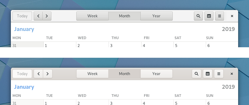
The increased contrast for header-bar, tab-buttons is an ergonomic improvement. You can now more clearly see which is the actively selected tab/button:
(top image is old. bottom image is new)
I'm glad they're doing this. It's one of the things I've struggled with sometimes with some GTK+ 3.x applications.Comment
-
GNOME is always improving. It's not by chance that it's the most polished DE.Comment
Comment