Announcement

Collapse
No announcement yet.

Pitivi's User Interface Is Getting Better Thanks To GSoC, Plus Other GNOME Improvements

Collapse
X
 
  • Filter
  • Time
  • Show
Clear All
new posts

  • Pitivi's User Interface Is Getting Better Thanks To GSoC, Plus Other GNOME Improvements

    Phoronix: Pitivi's User Interface Is Getting Better Thanks To GSoC, Plus Other GNOME Improvements

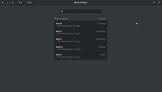
    If you have been less than satisfied with the user-interface of the Pitivi non-linear open-source video editor for Linux, you may want to try out their next release...

    Phoronix, Linux Hardware Reviews, Linux hardware benchmarks, Linux server benchmarks, Linux benchmarking, Desktop Linux, Linux performance, Open Source graphics, Linux How To, Ubuntu benchmarks, Ubuntu hardware, Phoronix Test Suite

  • #2
    It feels very modern now. Kudoz!

    Comment


    • #3
      thanks for your contributes to the Gnome project!
      If there's sort of wish list (and can't even find an official Gnome forum) I'd love next summer someone to focus on giving the users a couple of extra configuration/customization options. Any will do, doesn't matter which area of gnome/nautilus/gdm.. just few more so that we can feel like in charge of our desktop environment and not the other way around.

      Many thanks and god bless Gnomeville

      Comment


      • #4
        I have a complaint...


        Why is the "Cancel" button at the top right? Wasn't it supposed to be at the top left?!
        Not even GNOME developers themselves respect their HIG.

        Comment


        • #5
          Originally posted by tildearrow View Post
          I have a complaint...

          Why is the "Cancel" button at the top right? Wasn't it supposed to be at the top left?!
          Not even GNOME developers themselves respect their HIG.
          As an occasional user of gnome-disks https://en.wikipedia.org/wiki/GNOME_Disks I can confirm that the buttons are all over the place now. (try doing a "format drive" or other actions).

          Comment


          • #6
            Originally posted by tildearrow View Post
            I have a complaint...

            Why is the "Cancel" button at the top right? Wasn't it supposed to be at the top left?!
            Not even GNOME developers themselves respect their HIG.
            Not to mention that the action buttons shouldn't be in the title bar of the window in the first place... Usability disaster.

            Comment


            • #7
              Originally posted by msotirov View Post

              Not to mention that the action buttons shouldn't be in the title bar of the window in the first place... Usability disaster.
              They're their because it's the "modern way" of doing things. iOS, BB10 (both at OS and app level) and Android (only at app level for quite some apps) have buttons on the top left and right.

              But yeah, I'm not a fan of the modern way either.

              Comment


              • #8
                Originally posted by msotirov View Post

                Not to mention that the action buttons shouldn't be in the title bar of the window in the first place... Usability disaster.
                True for desktop, but not for tab-

                iOS, BB10 (both at OS and app level) and Android
                never mind.

                Comment


                • #9
                  Originally posted by Vistaus View Post
                  iOS, BB10 (both at OS and app level) and Android (only at app level for quite some apps) have buttons on the top left and right.
                  In the top bar, iOS only has navigation buttons (usually "back") and the option to change the displayed elements ("edit") -- what a PC user would find in a "View" or "Window" menu -- no real actions.

                  Comment


                  • #10
                    Originally posted by elvenbone View Post

                    In the top bar, iOS only has navigation buttons (usually "back") and the option to change the displayed elements ("edit") -- what a PC user would find in a "View" or "Window" menu -- no real actions.
                    I don't care. My thumb is at the bottom of the screen and reaching up requires a lot of stretching (it at all possible), so no elements at the top please UNLESS the screen isn't tall, then go ahead and place whatever you want at the top (I actually liked the top menu on webOS because the screen was never too big). Your comparison to PC's is totally flawed as I can easily reach the top with something called a mouse pointer, something that doesn't exist on mobile OS's (THAT IS, not by default as there's no mouse or touchpad by *default*).
                    Last edited by Vistaus; 15 August 2018, 12:09 PM.

                    Comment

                    Working...
                    X