
 Tweet
Tweet
Originally posted by furtadopires
View Post
-
Fair enough. -
Looks really nice. That wallpaper is really slick, and I really like the black/green color scheme, as usual.
Wow there sure are a lot of whiners on this board these days. Some of you must be getting paid per whine or something.Comment
-
Tried Mint for a while but found Ubuntu Mate performs better and offer much more flexibility to me. Especially love the awesome little fun toy: Mate Tweak, really love this one!Comment
-
-
there is no tearing in xfce, what year did you last try it? there is also an xpresent vs glx toggle for xfwm4... but DEs arent necessarily limited to their own compositors anywayOriginally posted by eydee View Post
the different gfx drivers also have their own potential vsync options separate from compositorsComment
-
Nice? It's virtually pitch black. If you installed this on your grandmother's PC she'd complain the monitor was broken.Originally posted by andyprough View Post
Linux Mint seems to be appealing to the teenager gamer crowd and vampires.
How is granny/newbie windows switcher going to turn their PC off when the shutdown button is black, and the menu behind it is black?Comment
-
Originally posted by tornado99 View PostI wasn't sure what you were going on about before, but I suspect the issue is the color calibration on your screen is either way off or you are partially blind (no offense intended).Originally posted by tornado99 View Post
If you do have accessibility issues with contrast you can switch to a very high contrast theme.
However the contrast is reasonable at least on my screen between the widgets you mentioned.
The below screenshot, which is using the default theme, will probably still look bad on whatever you used to look at LM before but if you look at it on a properly calibrated screen it should be clear that there is a LOT of contrast between the widgets you mentioned.
Or the included light theme:

Last edited by calc; 08 July 2021, 05:31 PM.Comment
-
calc ,
I used the KDE Kontrast tool to measure the ratio between the shutdown button and the menu in your screenshot - 1.37 i.e. terrible. Are you a graphics designer yourself? I find it hard to believe that anybody could rationally argue that black icons on a near-black menu is a good thing.
If Mint was a sophisticated modern distribution they'd have an invertible .svg iconset for all the key icons. Look at how KDE does it - on a dark theme the system icons are white. In your screnshots the icons don't change.
Also, I am well aware that you can change the wallpaper, or choose 35 different colour schemes. My point was that default shouldn't look like a joke.
And I haven't even mentioned that they're stuck on Kernel 5.4 which won't even boot on most modern equipment, such as my AMD laptop.
Mint's day to shine was about 10 years ago.
Comment
-
I'm not sure what 1.37 means in this context since I don't use KDE, but the mid-grey (Gray30) background is ~ 2.40x the color value of the buttons (4D4D4D vs 202020).Originally posted by tornado99 View Post
The background color is not even close to black so you either have a bad display or are near-blind.
LM ships two ISOs and has for both the 20.1 and 20.2 releases, one with the original 5.4 kernel and one with the hwe-edge 5.8 kernel.Originally posted by tornado99 View Post
Last edited by calc; 08 July 2021, 06:50 PM.Comment
-
It's funny how you resort to ad-homenims to try and make your case.Originally posted by calc View Post
So why is it that everybody else (KDE, Apple, Gnome, Microsoft) all use icon inversion with dark themes i.e. white/light icons, and Linux Mint doesn't?
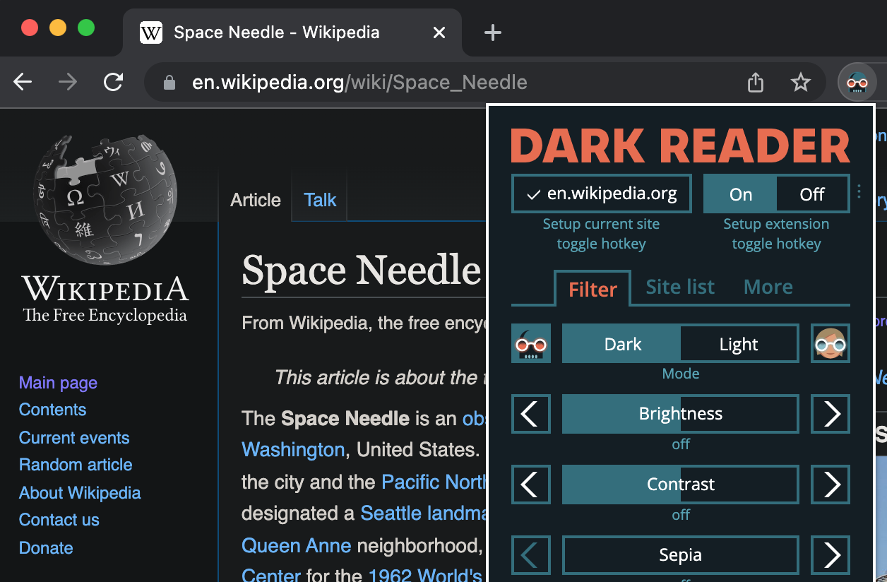
Or perhaps the excellent Dark Reader browser extension:
There's a lot more sophistication to a decent dark theme then merely swapping a few panel colours around. It seems to me that the folks at Mint thought that they'd try and make their ageing distro a bit more "trendy" without really understanding what they were doing.Last edited by tornado99; 08 July 2021, 07:36 PM.Comment

Comment