Announcement

Collapse
No announcement yet.

Microsoft's Latest Open-Source Contribution: A New Font For Terminals & Code Editors

Collapse
X
 
  • Filter
  • Time
  • Show
Clear All
new posts

  • Ropid
    replied
    Originally posted by kpedersen View Post
    Looks nice enough but I do not like the "programmer ligatures and glyph combining". ->, != get changed to weird characters. This will make selecting them or changing them awkward (have to delete the whole thing to change one character).
    I'm sure it is another one of those things that is great for amateurs but when used in anger under deadlines it just slows you down.
    You misunderstood how those kinds of ligatures work:

    Those ligatures are just for the font renderer. The changed glyph is only visible on the screen. In the actual text, your "->" or "!=" is still two text characters. In your editor, you can target each of the characters with the cursor and change them individually.

    For use in vim, you would need a terminal that supports these kinds of ligatures. You will not see the ligatures in urxvt or a vte based terminal. It works in Konsole and kitty.

    Leave a comment:


  • moriel5
    replied
    I don't really understand much about fonts (I used to just use the defaults, and not really pay much attention to how the characters looked), however ever since slightly after starting to use Solus, a few years ago, my preferred font is Clear Sans, and relatively recently also paying attention to sizes, hinting and antialiasing (it looks the same to me with our without hinting and/or antialiasing, however that is probably due to my choice of font sizes) and mono fonts (hey, I also use the terminal on an almost hourly basis, it's comfortable for many things), my favorite combination today is Clear Sans Regular, size 9 for everything but the interface, which is at size 8, and Monospace Regular, size 9 for monospace fields, with text scaling set to 1.

    I wish there was a mono font that looked just like Monospace Regular, but also supported ligatures (though libVTE and Gnome Terminal will first need to properly support them for me to be able to make use of them).
    Fira is nice (It fits pretty well in Firefox OS, which I absolutely love (sans a few design choices), despite it not being in development for at least two years, and it not giving me the tools I need (which can be rectified if there is enough coding skills, though I would like an open-source fork to be made specifically to revive old and weak phones, though almost completely for offline usage).

    Leave a comment:


  • Hi-Angel
    replied
    Originally posted by kpedersen View Post

    How are you able to select one of the characters with the mouse or visual select ('v' in Vim, not sure about Emacs)?
    Oh, sorry, I missed the part about visual selection. I can't imagine though why would you need to select a part of a != or >= or <=. That would be one character, it's faster to just type it.

    Leave a comment:


  • skeevy420
    replied
    And here I am using Droid Serif for random stuff and Source Code Pro as the monospace font.

    Leave a comment:


  • kpedersen
    replied
    Originally posted by Hi-Angel View Post

    FWIW, Emacs has pretty-symbols-mode which works similar, but doesn't have the problem you describe: e.g. if you have != represented by ≠, and then you delete one character from that ≠, you'd get a ! or = (depending on which side you deleted a character at).
    How are you able to select one of the characters with the mouse or visual select ('v' in Vim, not sure about Emacs)?

    Leave a comment:


  • Hi-Angel
    replied
    Originally posted by kpedersen View Post
    Looks nice enough but I do not like the "programmer ligatures and glyph combining". ->, != get changed to weird characters. This will make selecting them or changing them awkward (have to delete the whole thing to change one character).
    FWIW, Emacs has pretty-symbols-mode which works similar, but doesn't have the problem you describe: e.g. if you have != represented by ≠, and then you delete one character from that ≠, you'd get a ! or = (depending on which side you deleted a character at).

    ATM It breaks indentation though, so I enabled just a few characters: ≤, ≥ and ≠ these in my experience had never appeared in text in such way to have influence on indentation.
    Last edited by Hi-Angel; 19 September 2019, 07:29 AM. Reason: join and boldify the mode name

    Leave a comment:


  • Venemo
    replied
    The Hack font is better: https://sourcefoundry.org/hack/

    Leave a comment:


  • kpedersen
    replied
    Looks nice enough but I do not like the "programmer ligatures and glyph combining". ->, != get changed to weird characters. This will make selecting them or changing them awkward (have to delete the whole thing to change one character).
    I'm sure it is another one of those things that is great for amateurs but when used in anger under deadlines it just slows you down.

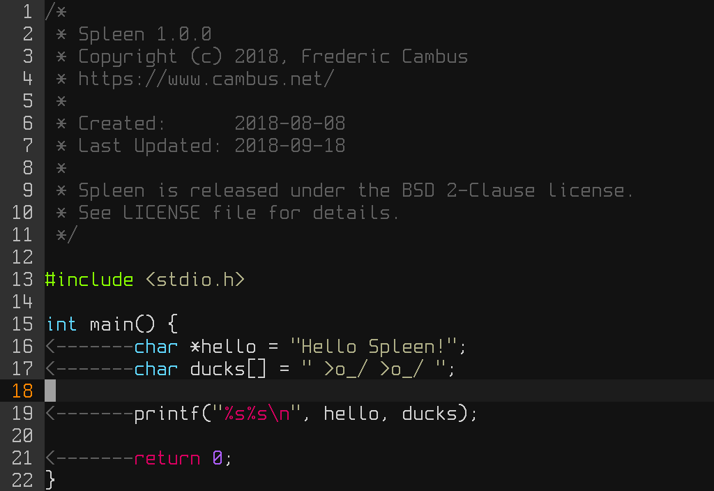
    As for fonts; the default OpenBSD terminal one (Spleen) is really nice. Looks extremely modern.


    Leave a comment:


  • Hi-Angel
    replied
    Since it's a thread of preferred fonts: among ones I used for coding, I like "Ubuntu Mono" the most


    It has kinda "squared" style, I like it.

    Leave a comment:


  • trizio
    replied
    Now, this is a bold move...

    Leave a comment:

Working...
X