
 Tweet
Tweet
People seem to like the current Phoronix graphs, as I've received messages before about the software it uses (it's custom written) or how they prefer them to OpenOffice.org graphs, etc.
As mentioned in Defining The Phoronix Test Suite, we will be GPLing that graphing code too for the testing software. Right now those graphs are automatically generated when loading the benchmarking data (stored in XML) into Firefox with the XSL sheet and then just saved from there.
Anyhow, yesterday I started rewriting the complete graphing object. Now it supports using True-Type Fonts, keys/combining multiple data sets, and other changes. In the end it just looks a lot nicer. Furthermore, there are now line graph capabilities if you prefer the information to be delivered that way.
This new object isn't yet completed as there are still a few alignment oddities, implement anti-aliasing on the line graphs, and some other things, but it will appear on Phorogit soon.
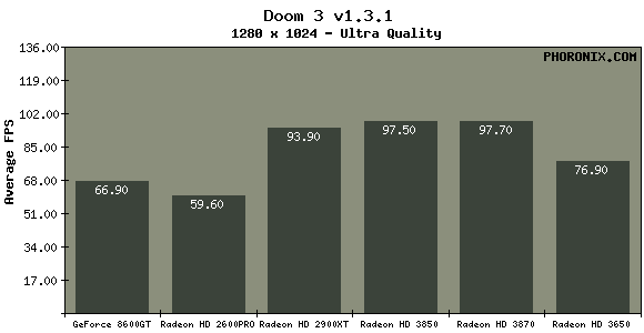
Below is a new sample, but pardon the information on the graphs as I am also using this graphing code for another project of mine.

As mentioned in Defining The Phoronix Test Suite, we will be GPLing that graphing code too for the testing software. Right now those graphs are automatically generated when loading the benchmarking data (stored in XML) into Firefox with the XSL sheet and then just saved from there.
Anyhow, yesterday I started rewriting the complete graphing object. Now it supports using True-Type Fonts, keys/combining multiple data sets, and other changes. In the end it just looks a lot nicer. Furthermore, there are now line graph capabilities if you prefer the information to be delivered that way.
This new object isn't yet completed as there are still a few alignment oddities, implement anti-aliasing on the line graphs, and some other things, but it will appear on Phorogit soon.
Below is a new sample, but pardon the information on the graphs as I am also using this graphing code for another project of mine.
Comment