If this is your first visit, be sure to
check out the FAQ by clicking the
link above. You may have to register
before you can post: click the register link above to proceed. To start viewing messages,
select the forum that you want to visit from the selection below.
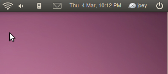
Correction: the themes are only available for Lucid users. Moreover, the panel icons are rendered at 16px instead of 24px as they should be (it's a big, it will be fixed tomorrow). Finally, the user who took the screenshots has changed the font to something non-default - looks good, though.
But, what is with the purple?!?!? Brown and purple?!? Ack! Orange and purple?!? Ack, again! Who is in charge of those changes?!?
What is their aversion to....blue, say? Orange and blue... that would go well together, imho.
I think the orange and purple goes great together. Orange and blue though??? Look at the cd cover idea, the orange and purple looks awesome https://wiki.ubuntu.com/Brand2
 Tweet
Tweet


Comment